Posts

Showing posts from 2017

HW14

Image
Web index I like this photo because of the warm colors its a complementary color scheme so it its its filed with a range of browns and warm colors i also like it because its a non commercial art its called the old town guard its art in the UK.

HW13

Image
I picked the Flag of  Saudi  Arabia because its one of my  favorite places  The  flag  of  Saudi  Arabia has a green field with large white Arabic writing above a white horizontal sword (the tip of the sword points to the hoist side of the  flag ). The Arabic writing is the Islamic statement of faith, "There is no God but Allah and Muhammad is his Prophet." Green is the traditional color of Islam.

HW12

Image
web index I picked this photo because I thought it was really cool I think the color unity is wiled but it really fits with the image

HW11

Image
page 47 print i picked this image because  i felt it was very Creative not sure if it was a graphic design image of a regular photo mashed together but i really liked the style to me it looks like this was a negative from film camera and they did all sort of crazy stuff too it  and got this crazy and cool background with the sea horse 

HW9

Image
Index this image is an example of analogous color schemes analogous color schemes use colors that are next to each other on the color wheel. They usually match well and create serene and comfortable designs. Analogous color schemes are often found in nature and are harmonious and pleasing to the eye. Make sure you have enough contrast when choosing an analogous color scheme. Choose one color to dominate, a second to support. The third color is used (along with black, white or gray) as an accent.

HW9

Image
Index I picked this image because randomness of images and color I like pixelated the image I found it to be very interesting because one main and different shades of color sort of surround the multiple colors inside

HW8

Image
index I picked this photo because its very cute 1st off and that negative space which are the bunny and the green which is is the positive i really do not know what to say about this photos other then that its looks cool.

HW7

Image
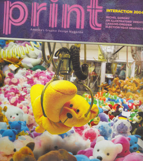
 i pick the front page of this magazine because of the great amount of depth within this Photograph and also all of the different colors that really make this a unified photo. the start from being a single color on the left to a mix of colors on the right which is really cool but the center color yellow puts the split in the photos which is also really cool

HW6

Image
index I picked this photo because i am a photographer so that's also why I like this picture a lot because of its depth i think its very good looking to be an old style vintage photo i like the depth in the background. it really brings out the whole photo in my eyes

HW5

Image
Index I picked this photo because I thought it represents rhythm in a unique way which involves design using text. the type of rhythm is being used is visual rhythm. I like the way the some of the letters are not letters but objects used to describe the letters.

HW4

Image
index of firms I picked this image because of its unique balance. I find it very cool looking with the mix of red orange and the one pick or purple shape. the whole image. what makes the image unique because of the one purple or pink shape. what makes the image balanced its because the colors match.

HW3

Image
Psychic Land sep 6, 2017 pg 24 I picked this image because mix of colors and shapes that make this image into one. to me it shows a unity of containment even those it had no border all the shapes and colors are on their own side in each space.leaving this very wonderful and creative mess that somewhat looks like they are all mixed in together.

HW2

Image
Book. August 2017, page 67 I picked the page because its variety is very crazy as you can see from the mix of color to the mix of fonts everything is put well in its place as a cover design and you would look at the whole thing not just one part of the whole thing